
Calvary Wealth
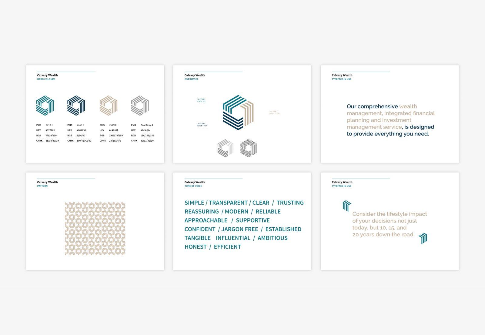
The elegant brand mark was designed to showcase the three defining perspectives of the Calvary Wealth brand – purpose, intention and direction – alongside a strong corporate colour palette. The Calvary device was designed to be used as a whole or split into its three separate parts, creating a supporting system that runs throughout the branding produced for the Calvary Wealth team.
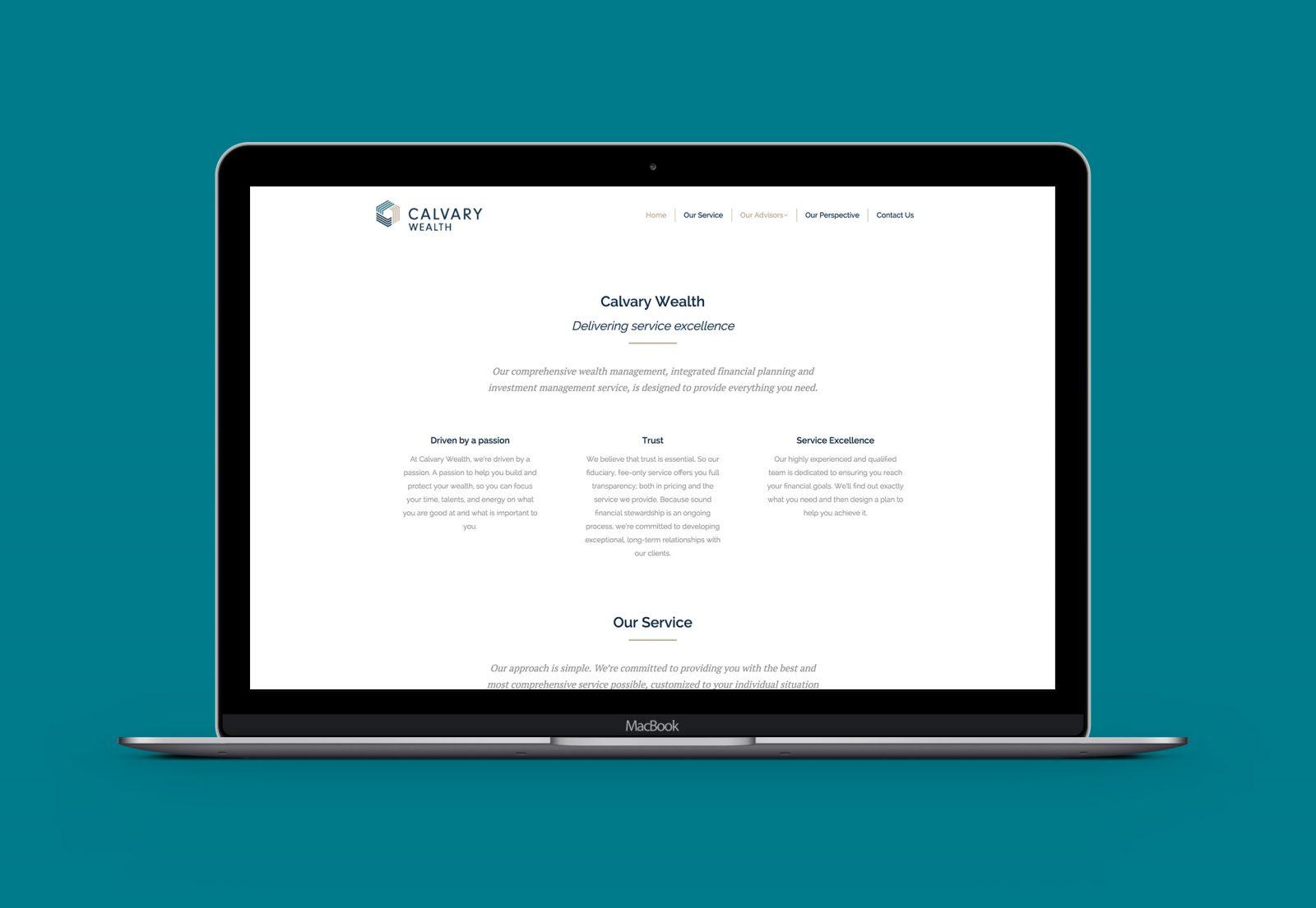
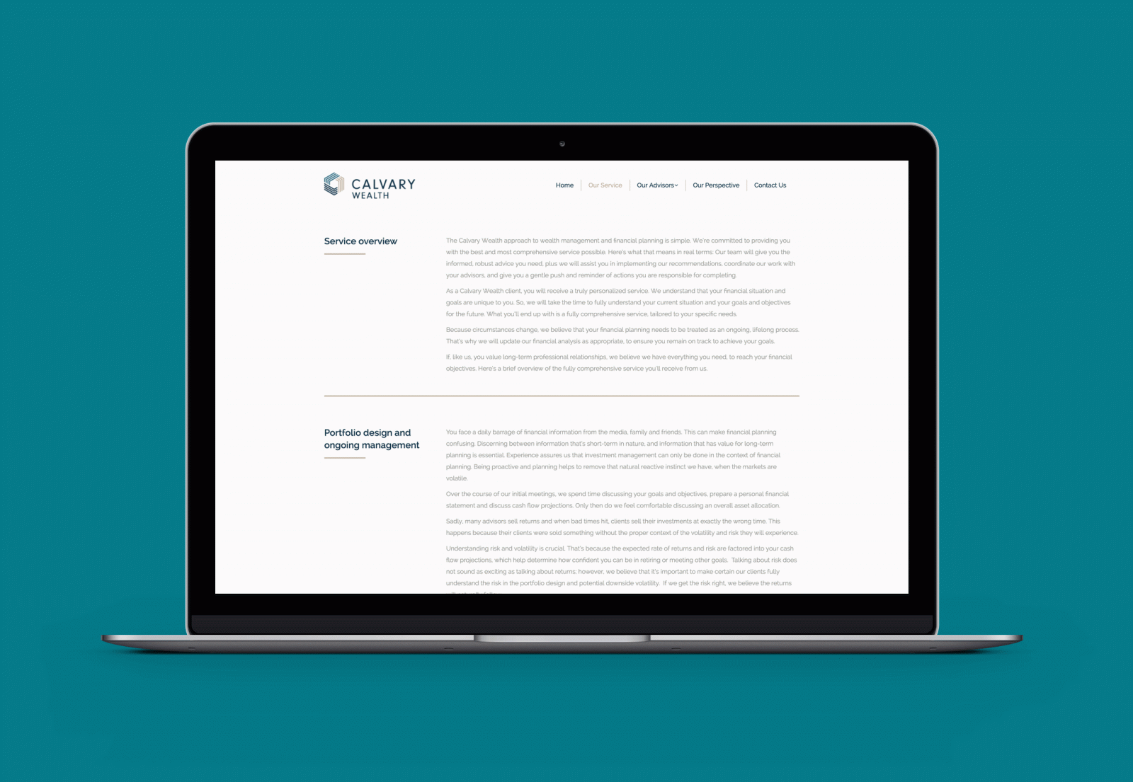
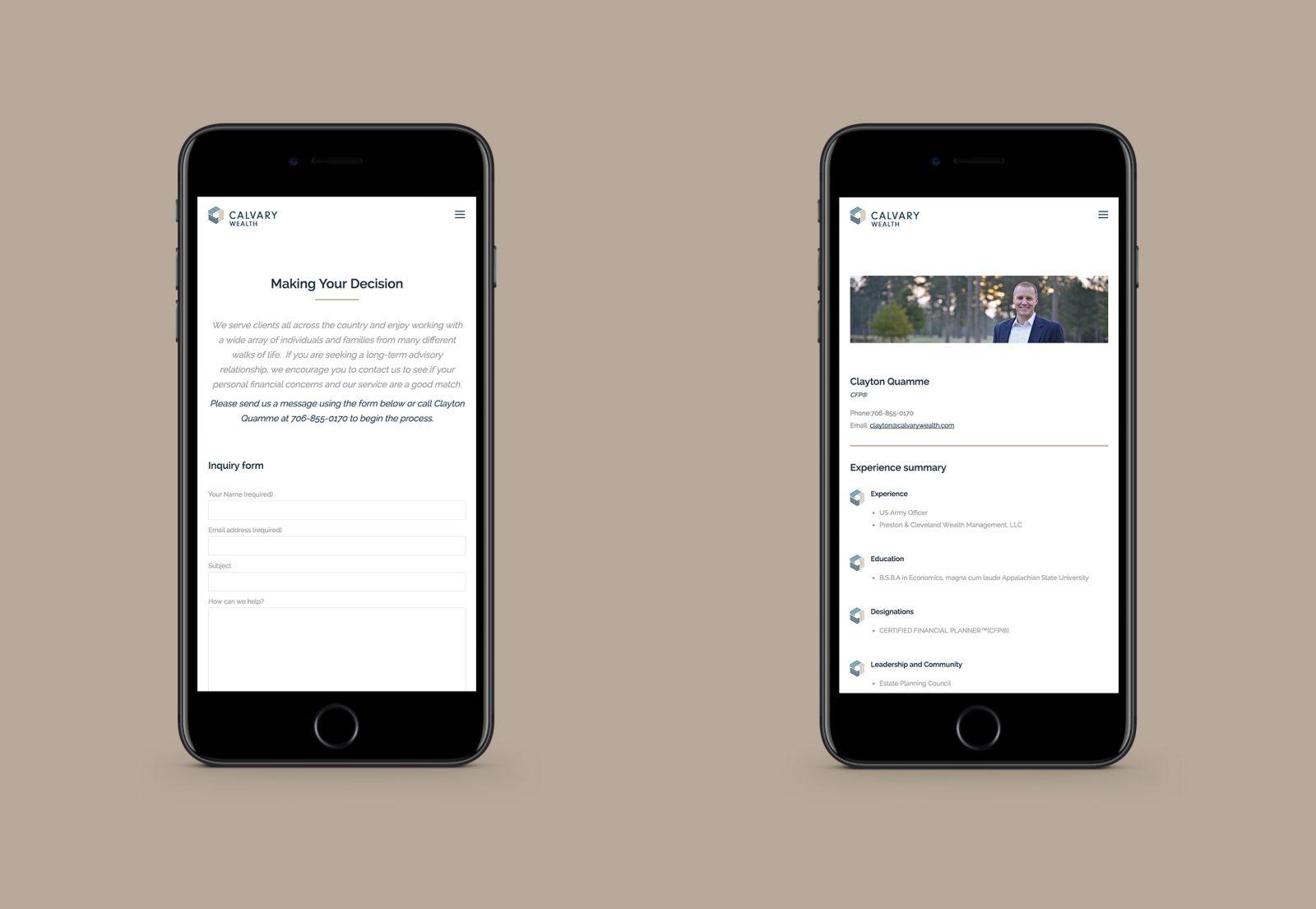
The website was developed to focus on the services that are key to differentiating Calvary Wealth from their competition. The services section of the website offers a comprehensive glossary of the personalised service clients receive, and even though this section was content heavy we created a clean, easily browsable website that continues to work as a marketing tool and hub of information.
We worked on a mixture of corporate engagement material leading up to the launch of the new business; from address labels to client facing digital and printed literature, helping Calvary make the transition from their old brand to the new one as smooth as possible.
View the Calvary Wealth website > calvarywealth.com
What we did
Print Design | Branding | Brand Guidelines | User Experience | Photo Styling | Wordpress Website | Custom CSS | Content Strategy | Brand Strategy
